I think of myself as a visual sort of guy. I hardly ever read instructions and usually go right to the diagram. If “A” goes into “B” and there’s a few arrows showing me the way…I’m good to go! So with that in mind, (drum roll please) I offer the “Visual Guide to Using the Ka-Blam Template!”
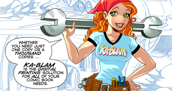
I’m going to focus on a cover image here because I noticed most people seem to be struggling with this particular issue. You can also apply this to your interior pages as well. It’s all the same; just a different animal. In the spirit of full disclosure and blatant self-publicity; I’m using one of my own creations, ELF `n Troll, (available at Indy Planet and Comicsmonkey)! Don’t be a hater!
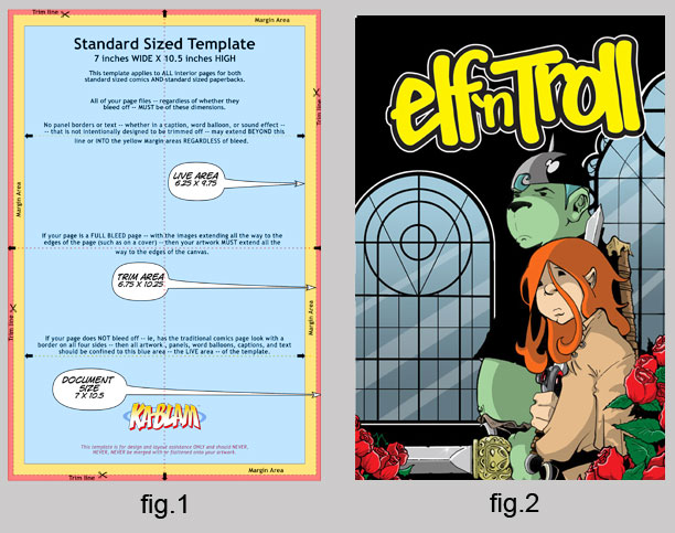
Let’s start out with the Standard Comics Template (fig 1) and the Elf `n Troll cover, (fig 2). On the template, the blue area in the middle is the “Safe Zone”. This is where you keep all the important stuff such as logos, price boxes, exciting blurbs and loved ones. Nothing can happen to you here! What follows next is the yellow area which we’ll call, “The Caution Zone!” This area probably won’t get lost in the trimmer but, why risk it? The red/orange area (depends on your monitor) is the “Dead Zone!” If you leave a piece of your logo, cover copy or loved ones hanging around in this area, you’ll never see them again!

In (fig. 3), we’ve placed the Elf `n Troll cover on top of the standard comic template. Everything is in the “Safe Zone” so what could possibly go wrong? Well sure, our logo is looking good but, we now have that big white border around our cover. (fig. 4). Let me explain why this is a bad thing. When we go to trim the book, we trim along the line between the red and yellow part of the template. Now we are only human and occasionally the hand does shake a bit; especially after you’ve been trimming comics for 12 hours. If your ENTIRE cover image is in the safe zone, you will definitely still have a white border going around your image. If your ENTIRE cover is image is all the way into the yellow area, you still run the risk of some white lines or borders coming through. As I mentioned, we’re only human. Let’s get back to our cover now and I’ll show you how to avoid any of those nasty white lines and borders popping up.

What I’ve done here, (fig. 5) is to lower the opacity of my cover image so that I can show you what’s going on under the covers. (Pun intended) I wasn’t happy with the big white border around my cover and don’t want to take any chances that some white marks may show up along the edges of my cover, so what I’ve done is increase the cover size to cover the ENTIRE template. That’s right; I left the “Safe Zone”, wandered over into the “Caution Zone”, got all adventurous and jumped into the “Dead Zone” as well. I’m just crazy like that! My craziness has paid off and my final cover no longer has that annoying white border around it. It also gives us some room to work with when we go to trim the book. Yes, we will leave a small portion of your cover on the trimming floor but, we now have a perfect cover! (fig. 6). I’m a happy camper now and my cover is looking just the way I want it to. The images that are living in the “Dead Zone” will get trimmed off but I’m now 100% certain that my cover will not have any white borders showing up.

I now direct you to, (fig. 7). You’ll notice that my logo is still in the “Safe Zone”, which I’ve marked with a bright green box. I may be crazy but, I’m not certifiable…yet! If I wanted to put my company logo, price box and any copy on the cover or, if there were any part of the image I didn’t want to lose, I’d have it living within that green outline.

As I mentioned above, this little visual guide also applies to your interior pages as well. If you follow these steps then you should have no issues or problems with your covers or interior pages. In closing, the final step you should perform before sending us your files is to delete the layer you have your template on.
Now go make some comics!
Play Nice!
Tony
